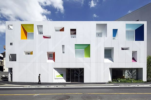
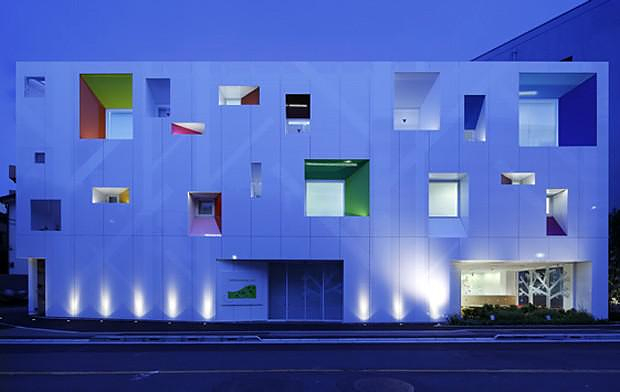
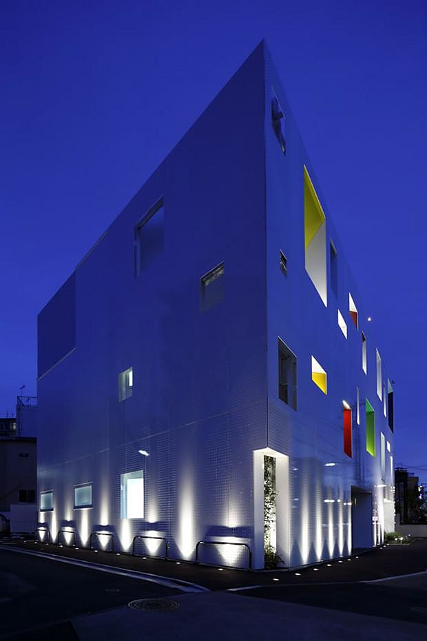
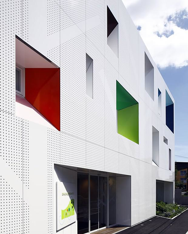
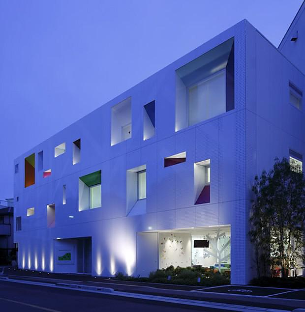
While most bank buildings are flat constructions that impose on people with serious and strict lines the Sugamo Shinkin Bank by Emmanuelle Moureaux is not.
If we asked which color would fit better a bank building the most common answer would be a sterilized and technocratic grey. Yet, the Japanese Sugamo Shinkin bank wanted to stand out from and created a different space, pleasant and bright, where clients would come and go with a smile on their face. For the cause they hired Emmanuelle Moureaux Architecture + Design team, well known for their innovative ideas.
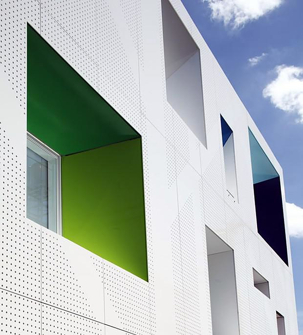
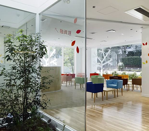
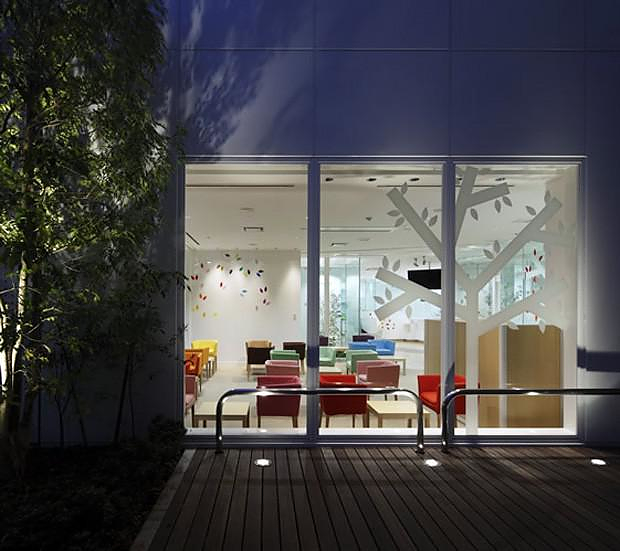
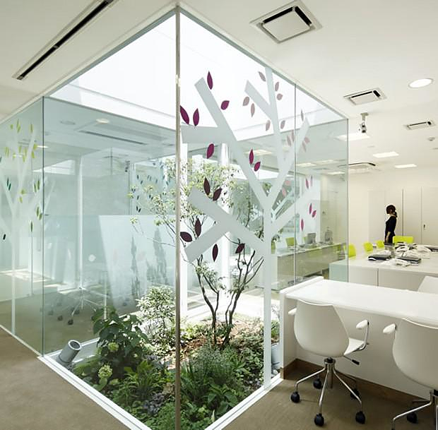
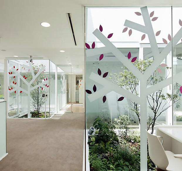
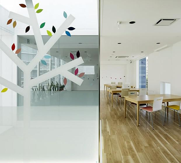
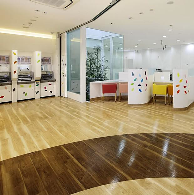
While the building’s design is functional and strict, it is not sterile and depressive. From outside, it looks like a advertising company or school project, as the color elements show an innovational character. The interior matches the exterior with a colorful continuity and features a number of skylights for natural lighting. The Sugamo Shinkin Bank is an refreshing project that makes the difference to the blunt and lifeless bank buildings (and banking business in general).
The Sugamo Shinkin has a moto: “We are proud to serve happy costumers.” It goes without saying that the building is coherent to the general marketing culture of the company.
Emmanuelle Moureaux has a unique relation with colors and a deep understanding of Japanese culture as a permanent resident in the country for several years. Both facts qualified her for the design of a “happy” bank.
The exterior shell of the building is made of steel which is perforated for thermal management, as well as for aesthetics. The interior of the building includes internal gardens with colorful greenery as a reference to garden-focused Japanese architectural culture.